Year Founded
1899
Founder
Giovanni Agnelli
Headquarters
Headquarters
Parent
Stellantis Europe
Official Site
1965
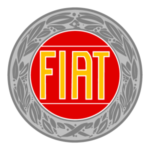
In 1965, the company once again began using the 1930s logo. But this logo is slightly different in colour palette from the previous one. In this logo, the colour of the wordmark is yellow and its outline is white. There are two horizontal lines above and below the Fiat wordmark which are in white. The silver colour of the outside part is also refined.
1959 Again
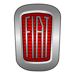
In 1959, the company updated its logo again and added a horizontally striped pattern on a red background. The height of the rectangle looks less than the previous version and the corners look more rounded. Due to this, it looks more sleek.
1959
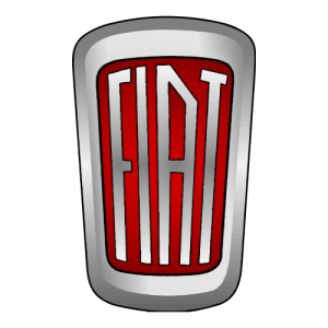
After 10 years, the company updated its logo again. There were many small changes in this logo. The designer gave the curve shape to both the top and bottom lines of the rectangle and the corners of the rectangle were round. The company shaded the rectangle in such a way that it provided a 3D look. The letters of Fiat have an italic upper bar of F and T. Overall, this logo provides a soft look.
1949

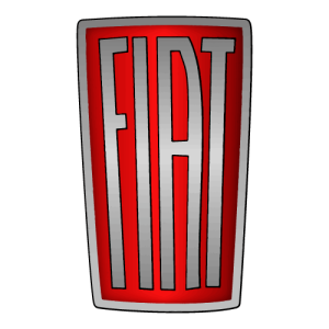
The company has removed the triangular part of the rectangle in this logo and the upper curve is now straight. The shade of white light is again in the centre of the font and now the line under F and T is straight while the lines of I and A are slightly sliding. There is no other change in the logo.
1938
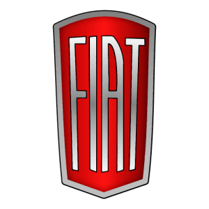
This time, the company has given a triangle look to the lower part of the rectangle and an arch is being formed on the upper part. In the previous logo, the white light shade was in the centre of Fiat’s wordmark, but in this logo, the shade is at the top and bottom of the font, making the middle of the font look darker. The lower part of the font now slides slightly downwards instead of sharp edges.
1932
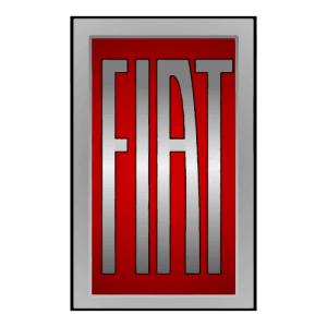
In this logo, the company replaced rounded corners with sharp edges. There is a shade of white colour in the centre of Fiat’s font which provides a 3D look. For nearly 30 years, the company used the same previous logo, with little change.
1931 Again
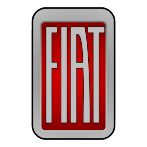
This year, the company made major changes to its logo. Changed the shape of the company’s logo from a circle to a vertical rectangle and because of the vertical rectangle, the company used the words of elongated FIAT in it. The corners of the rectangle are rounded and there is a black outline outside it. The logo no longer has the laurel wreath and is replaced by a simple grey colour, just like Fiat’s font. Like the previous logo, it also has a bright red colour that shows the association of Italian cars in the international competition. The company first used this logo on the Fiat 524 and with the launch of the 508 “Balilla”, this new logo became famous worldwide.
1931
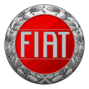
The company changed the sky blue colour to the red victory colour. The Fiat wordmark on this background looks very modern. Other than that, there was no change in the logo.
1929
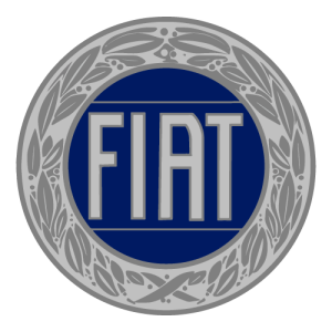
In 1929, the company again changed the colour palette of the old logo. This time the company changed the color of the frame to silver and the Fiat word was also in the silver color. However, the company has converted the dark blue on Fiat’s background to light blue. If we talk about letters, the letters in this logo are bold.
1925
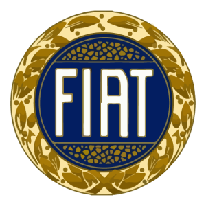
In 1925, the company changed the colour palette. This logo features Fiat in white colour on a dark blue background. The colour of the laurel wreath was also changed by the company. You can consider this colour as a Henna colour.
1921
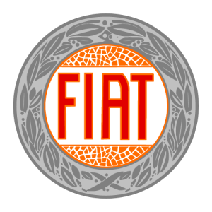
From 1921, the company started using the circular logo. In this logo, FIAT was written inside the circular part in red colour on a white background while the word Fiat is separated from the upper and lower part of the circle by 2 horizontal lines. A shield of laurel wreath covers this circle. Actually, during this period Fiat cars started winning many sports races, and the laurel wreath was a great symbol for sporting victories. The company first used this logo in 1921 on the 801 Corsa. This logo was a great choice for the time.
1908
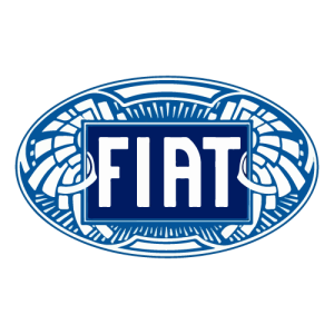
According to some experts, Fiat designed this logo in 1904, but many believe that the company started using this logo in 1908. When Art Nouveau became popular everywhere, the company decided to create a logo using this art. The color palette of this logo is similar to the previous logo but the design is different. Now the logo is in the form of an oval and inside it is written Fiat on a dark blue rectangle. The elements of this logo are designed in such a way that it looks like a rising sun and olive branches.
1903
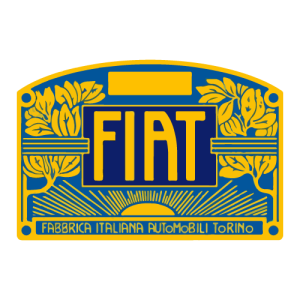
In 1903 Fiat used an Art Deco-type logo. This logo consists of a rectangle, in which the top line of the rectangle is an upward curve. Inside this blue colour and gold outline rectangle, there are 2 major rectangles. Fiat is written in a rectangle inside. This time the font style is also very different from the previous font. The left side line of A is straight while the right side line is diagonal from above and then straight after the middle line of A. All these letters are in gold colour. At the bottom is the abbreviation of the company name “Fabrica Italiana Automobili Torino” in a horizontal rectangle. All the letters in this abbreviation are capitalized except o.
1901

In 1901, the company used the wordmark as its logo. The story behind it is that the company’s chief designer, Mario Majoli, was passing by the factory building one night in a car and he felt that a wordmark looked excellent on the building. In this logo of the company, all the words of Fiat are arranged in such a way that there is equal space between them and they look like a rectangle.
1899
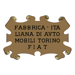
The company’s first logo was decided by nine partners and was a golden rectangle with many edges that curved inwards. Experts call it the child logo of its time. The name of the company was hand-engraved on this brass parchment. The company name was preceded by a space followed by an N. This space is left so that the serial number of the frame can be written here. The company used this logo for two years.
Fiat manufactures compact cars, sedans, SUVs, and commercial vehicles. Its vehicles are primarily manufactured so that everyone can purchase them. It manufactures small cars that are easy to drive in the city. Fiat manufactured its first vehicle, the Fiat 3½ HP, in 1900. However, Fiat did not design this car. After that, its successful journey never ends. During World Wars I and II, Fiat manufactured military vehicles, trucks, aircraft engines, tanks and other equipment.
Fiat actively participates in motorsports. However, that’s not its primary focus. However, its subsidiary Abarth uses Fiat components and makes high-performance racing cars. Fiat cars participate in Formula 1, Formula 2 and other racing events. In 2014, Fiat merged with Chrysler Group to form Fiat Chrysler Automobiles (FCA). Then, in 2021, FCA merged with PeugeotSociété Anonyme (PSA), to create Stellantis.
Fiat is very popular in Europe. Its Fiat 500 and Panda are very famous in Europe. It has a limited presence in North and South America, focusing on small cars and SUVs. Fiat is currently increasing its operations in Asian Market specifically China and India. Besides these markets, it has a small presence in the African market.
Fiat recognises its social responsibility and focuses on reducing CO emissions. Its latest model engines are fuel efficient and have advanced emissions control systems. They are working towards a more sustainable future by developing electric vehicles (EVs). They launched their first electric car, the Fiat 500e, in 2020 and working continuously to develop fully electric cars in quantity.



I accept direct messages and business inquiries by anyone on LinkedIn for free, even if we’re not connected.